I've been developing mQlicker for approximately two years. Dr. Raban, Sverre and I co-founded a startup about two year ago and we started developing it. The first official release happened last February, and now we are about to release a new version of mQlicker. Before we do, I'd like to point out the new features and changes in the new one.
mQlicker is a audience response system (audience interaction system / classroom interaction system) which can give a voice to the audience. It can be used for classroom, presentation, lecture, survey, quiz, etc. It consists of two main UIs which are the user UI for those who want to get the responses from people and the respondent UI for those who respond.
What's new in new mQlicker
1. Respondent UI
1.1. Design Change in Respondent UI
OLD: Respondent UI
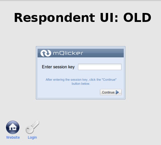
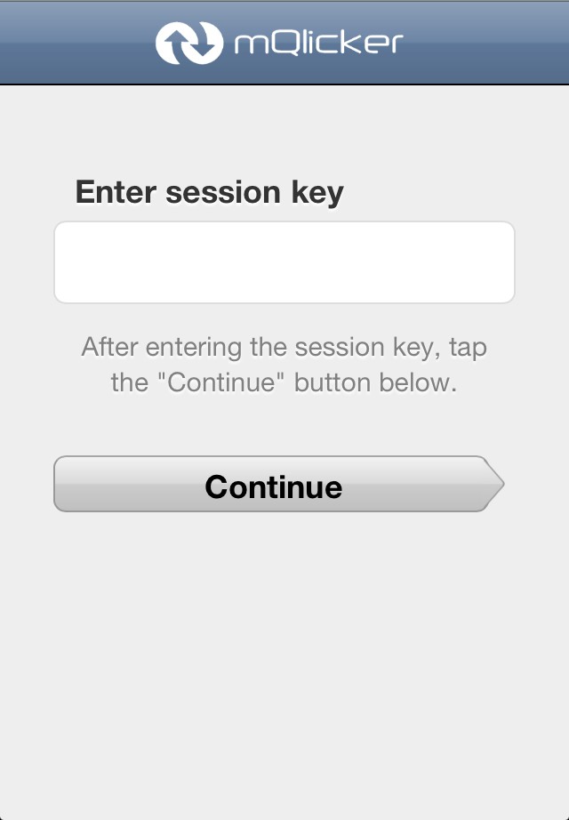
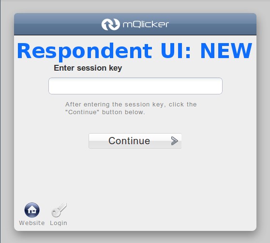
The old version of the respondent UI for computers doesn't look so pretty. The look is also too different from the one displayed on the mobile devices (Please see how it looks on iPhone). The new one looks prettier and similar to the mobile one.
Respondent UI: iPhone
New Respondent UI
1.2. Page Breaks.
OLD: All qeustions on one page
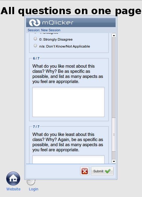
In the old version, there is no way to put a different number of question on one page. So all the questions are on a single page as you can see.
New Respondent UI with different number of question on each page.
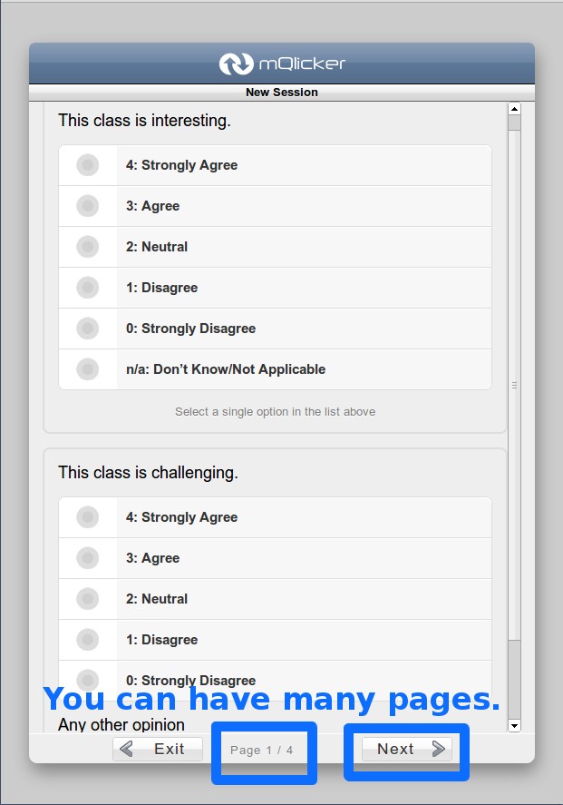
The new version has page break so it can have many pages with a different number of questions as you wish.
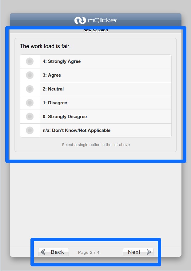
New Respondent UI with one question on one page.
1.3. Optional Questions.
Old Respondent UI without optional questions
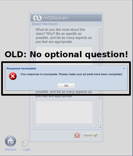
The old version does not support an optional questions which means all the questions are mandatory. Therefore, if you forget to answer any question, your answer cannot be submitted.
New Respondent UI with an optional question
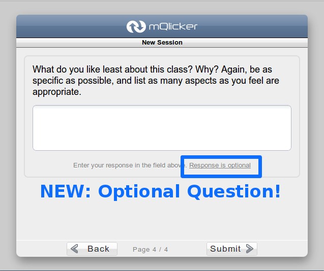
From the new version, optional questions can be created.
1.4. Missing Answer Indicator for Mandatory Questions.
Old Respondent UI with no missing answer indicator
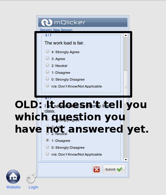
There was no way to find the missing answers without checking each question carefully when you forgot to answer some questions.
New Respondent UI with a missing answer indicator
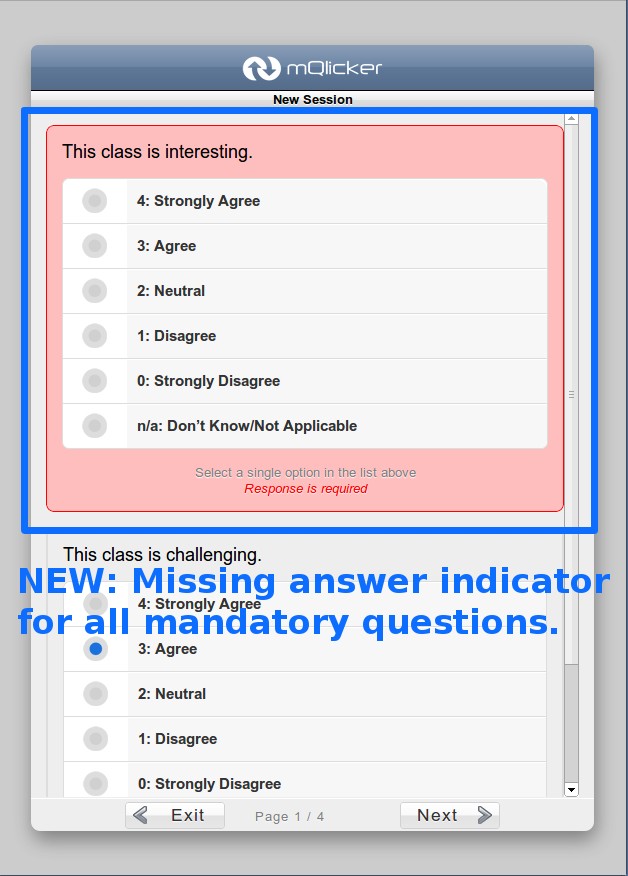
The new one highlights it, so you can simple take care of those missing ones.
1.5. Other Answer
Old Respondent UI with no other answer
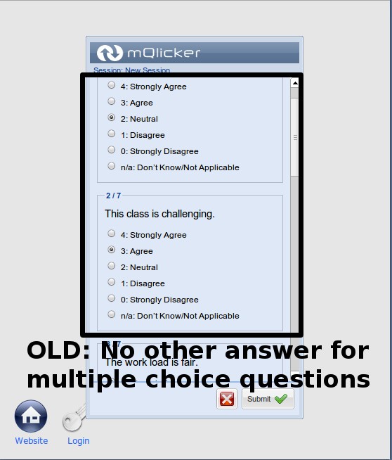
The multiple choice questions did not allow the respondent to answer anything other than the ones provided with the question.
New Respondent UI with other answer
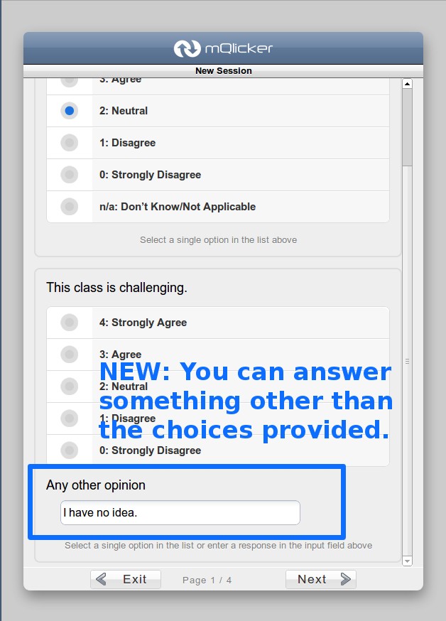
However, the new version has other answer field so now you can get some other opinions than what you provided from the respondents.
1.6. Result is Visible to the Respondents.
Old Respondent UI with no result after submission
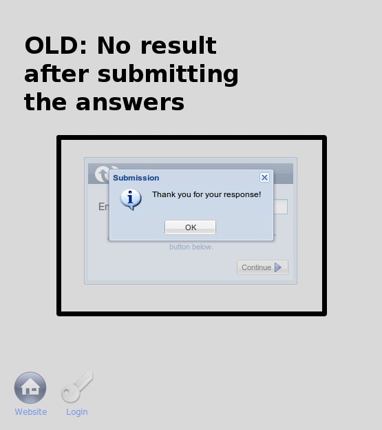
Previously, the respondents can see the result of all the responses after submit their answers.
New Respondent UI with result after answer submission
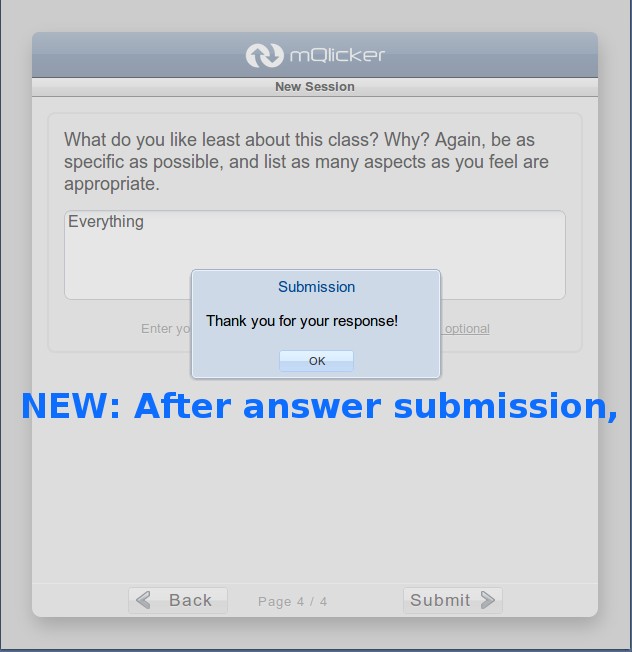
New Respondent UI with result after answer submission
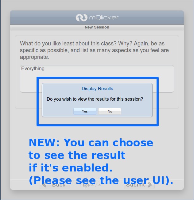
New Respondent UI with result after answer submission
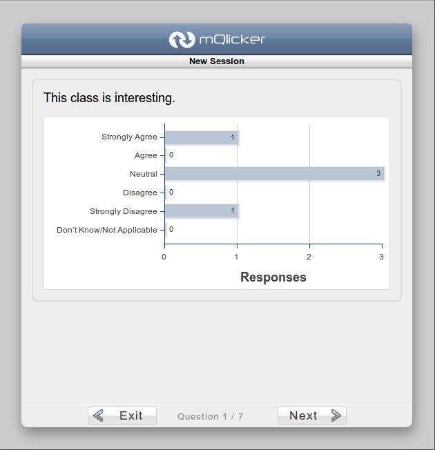
New Respondent UI with result after answer submission
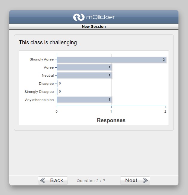
With new one, it is possible to see the result although it needs a little more improvement (the improved one will come soon).
2. User UI
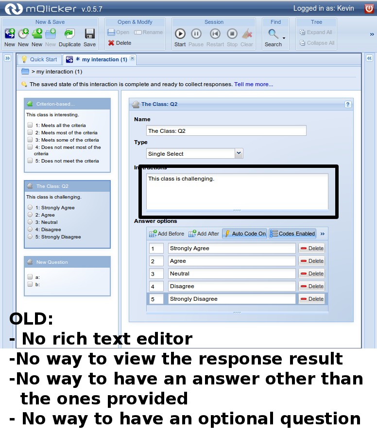
Old User UI
New User UI
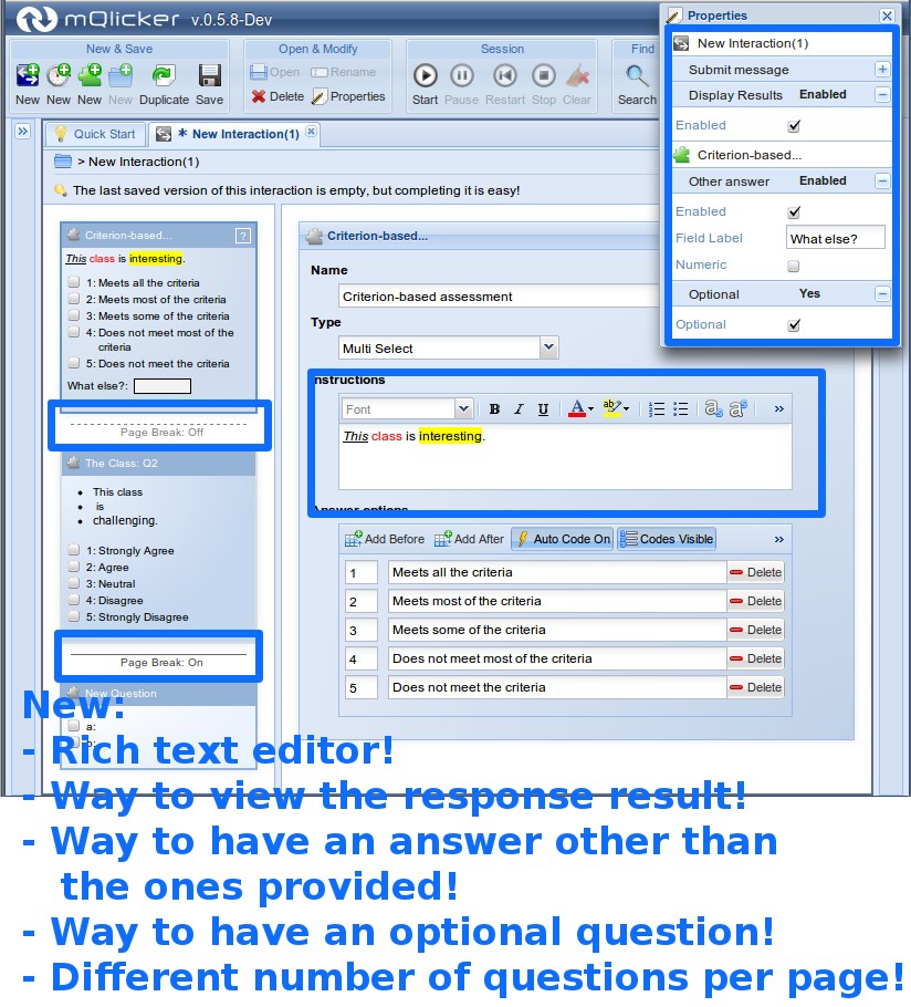
2.1. Rich Text Editor
Please compare the new one with the old one. You could only have plain text without any formatting. Now, it is possible to format your text just like using a word processor.
2.2 Result Visible to Respondent
As already mentioned above, you can set the interaction to make the response result visible to the respondents once they submit their answers.
2.3. Other Answer
You can make the multiple choice questions have other answers with the label you want (Other? Something else?, etc).
2.4 Optional Question
Questions and be optional so not all of them are mandatory.
2.5. Page Breaks
You can easily set the number of questions per page by just clicking the page breaker bar to enable and disabled it.
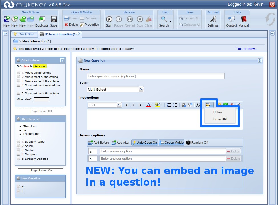
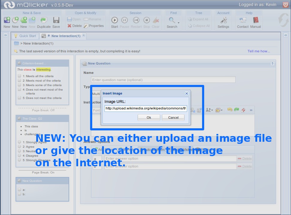
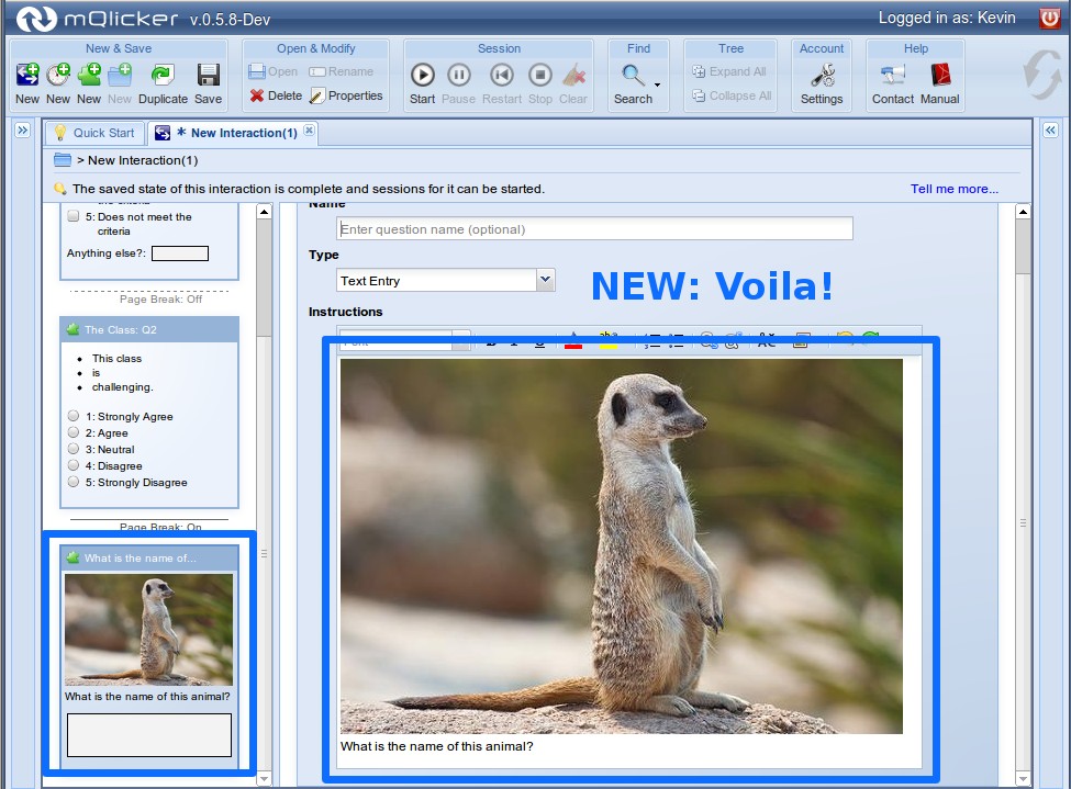
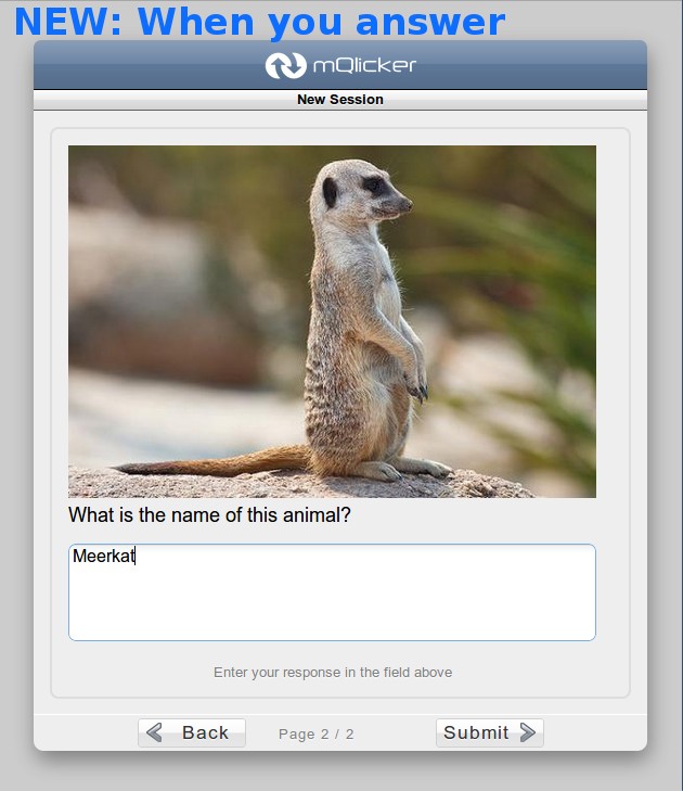
2.6. Images in Question
Now you can upload an image file or set the location of the image to display it with the question.
User UI - Question with image
User UI - Question with image
User UI - Question with image
Respondent UI - Question with image
2.7 Slide type question
Sometimes you only need to provide some text that you want your audience to read. Now you can have a slide type question which only displays the text you provide!
2.8. Running Session Indicator
New User UI has a running session indicator
![]()
The new one has a running session indicator icon on the interaction so you can easily recognise which one has any running sessions without expanding interaction.
OK, that's it. There are still several minor things but not that big deal so I rather not talk about here. I hope you enjoy the new mQlicker.